Regression
The purpose of regression is to fit a line. This line is used to interpret some sort of relationship between one or more “x” variables and a “y” variable. For example:
describes a straight line with intercept \(\alpha\) and slope \(\beta\). The variable x is referred to as the regressor in this model. Models can have multiple regressors.
We can generate some data that draws such a line. In this example, take \(\alpha=4\) and \(\beta=0.5\).
import pandas as pd
import numpy as np

np.random.seed(0)
line = pd.DataFrame(columns=['x','y']) # creates an empty DataFrame (a DataFrame with no rows) named 'line' that has column names 'x' and 'y'
line['x'] = np.random.randint(low=-10, high=10, size=100)
line['y'] = 4 + 0.5 * line['x']
line.head()
| x | y | |
|---|---|---|
| 0 | 2 | 5.0 |
| 1 | 5 | 6.5 |
| 2 | -10 | -1.0 |
| 3 | -7 | 0.5 |
| 4 | -7 | 0.5 |
Using the seaborn plot function lineplot(), we can visualize this line.
import seaborn as sns

sns.lineplot(x='x', y='y', data=line)
<AxesSubplot:xlabel='x', ylabel='y'>
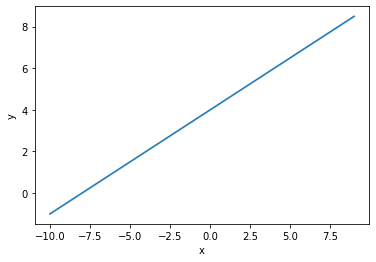
No surprises here, we get a straight line. The slope is one-half, and the intercept is 4.
Concept review: Report the descriptive statistics for x and y below.
line.describe()
| x | y | |
|---|---|---|
| count | 100.000000 | 100.000000 |
| mean | -1.120000 | 3.440000 |
| std | 6.148466 | 3.074233 |
| min | -10.000000 | -1.000000 |
| 25% | -7.000000 | 0.500000 |
| 50% | -1.500000 | 3.250000 |
| 75% | 5.000000 | 6.500000 |
| max | 9.000000 | 8.500000 |
In the real world, relationships between \(x\)’s and \(y\)’s are usually complicated. That is, there is no line that perfectly describes the connection between \(x\) and \(y\). Our goal is to find the best possible approximation of a relationship. For instance, change the above equation to
where \(u\) is some random, un-observed phenomenon that makes any pair of values \((x,y)\) partially unpredictable. Consider the following simulated dataset, where \(y\) and \(x\) have a known relationship (we know \(\alpha=4\) and \(\beta=0.5\)) with some error thrown in to the mix.
np.random.seed(0)
df = pd.DataFrame(columns=['x','y'])
df['x'] = np.random.normal(2, 1, 100)
df['y'] = 4 + 0.5 * df['x'] + np.random.normal(0, 0.5, 100)
sns.scatterplot(x='x', y='y', data=df)
<AxesSubplot:xlabel='x', ylabel='y'>
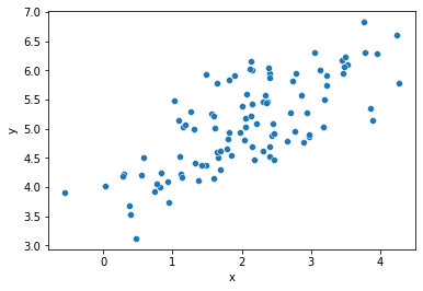
In this example, the random error component \(u\) makes it so that \(y\) is no longer perfectly described by \(x\) and the parameters \(\alpha,\beta\).
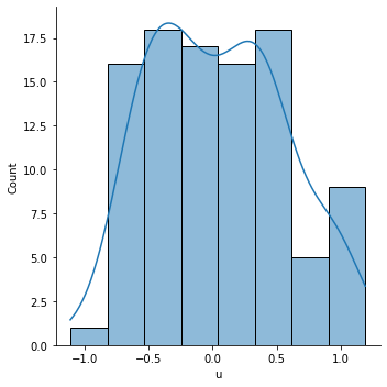
Concept review: Create a new column of data called 'u'. Set 'u' equal to 'y' minus (4 plus one-half 'x'), then plot the distribution of 'u'.
df['u'] = df['y'] - 4 - .5*df['x']
sns.displot(df['u'], kde=True)
<seaborn.axisgrid.FacetGrid at 0x7f520fef43d0>
When performing analytics, we’ll be given data. Suppose that data looks like what’s described in df. So, for example, we can see that the first few and last few rows look like:
df.describe()
| x | y | u | |
|---|---|---|---|
| count | 100.000000 | 100.000000 | 100.000000 |
| mean | 2.059808 | 5.070910 | 0.041006 |
| std | 1.012960 | 0.765313 | 0.519940 |
| min | -0.552990 | 3.120177 | -1.111702 |
| 25% | 1.356143 | 4.509295 | -0.372715 |
| 50% | 2.094096 | 5.037010 | 0.012327 |
| 75% | 2.737077 | 5.754808 | 0.423740 |
| max | 4.269755 | 6.823602 | 1.191572 |
When all we have is the data, the values of \(\alpha\) and \(\beta\) are unknown to us. In this case, our mission is to use linear regression so that we have the best possible linear fit between \(y\) and \(x\).
Such a “line of best fit” is shown below.
sns.lmplot(x='x', y='y', data=df)
<seaborn.axisgrid.FacetGrid at 0x7f520fe443d0>
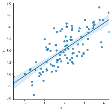
This line is solved, by seaborn, using regression. But seaborn only computes the regression fit for the purposes of making a plot. It doesn’t tell you what the beta coefficient, \(\beta\), is estimated to be. Nor does it report the estimated intercept \(\alpha\).
When parameters like \(\alpha\) and \(\beta\) are estimated, we usually put “hats” on them to denote that it’s an estimated value. Thus, the estimated relationship is given by
which tells us that, using the estimated values for \(\alpha\) and \(\beta\), one would estimate the value for \(y\) to be \(\hat{y}\), given the value \(x\).
There are many commands that can be used to generate this linear regression fit, and those will be discussed in a little bit.
First, let’s consider the effect of an outlier on the sample.
Let’s hard-code a data error in the pandas DataFrame variable df by using the .loc function to change the y value for one of the rows.
df.loc[0,'y'] = df.loc[0,'y']*10
What we’ve done in the above line of code is increase the y value of the first observation by a factor of 10. This is a reasonable error to consider, using real (non-simulated) data, someone could very well accidentally hit the zero key when entering in rows of x and y data by hand.
First, let’s look at the boxplot.
sns.displot(df['y'])
<seaborn.axisgrid.FacetGrid at 0x7f520fe19e20>
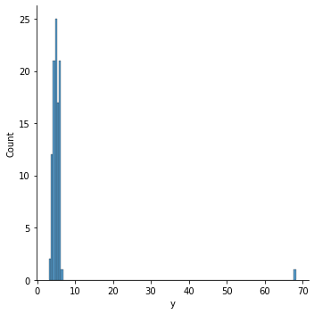
The outlier we’ve entered stands out clearly. We can verify that the outlier we’re seeing is in fact the first row we modified by typing:
df.iloc[0]
x     3.764052
y    68.236015
u     0.941575
Name: 0, dtype: float64
and noticing that the y value there is indeed the point we’re seeing as an outlier in the data.
What happens if we don’t correct for this issue when we perform an analytics task like linear regression? Note that the scatter plot likewise shows a big problem due to the outlier.
sns.scatterplot(x='x', y='y', data=df)
<AxesSubplot:xlabel='x', ylabel='y'>
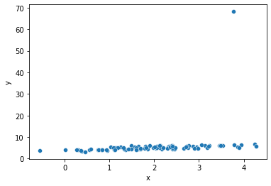
How can we expect Python to find a line of best fit through that scatter plot, when there is such an egregious outlier in the plot?
Look what happens in the regression:
sns.lmplot(x='x', y='y', data=df)
<seaborn.axisgrid.FacetGrid at 0x7f520e307730>
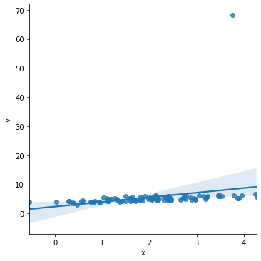
While it may be hard to see the change, note that the line of best fit now reaches above all of the y values on the right hand side of the scatter plot, and dips below them on the left hand side. In the earlier regression, this did not happen. What’s occurred here is the line of best fit now has a much steeper slope than it did before. This is because the outlier point, which is towards the right side of the x distribution and is significantly above the rest of the y data, skews the line of best fit to be much more positively sloping.
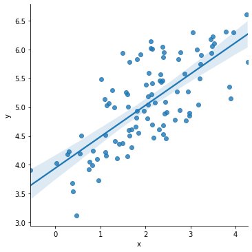
We’ll discuss solutions to remove outliers on an ad hoc basis.
sns.lmplot(x='x', y='y', data=df[df['y'] < 20])
<seaborn.axisgrid.FacetGrid at 0x7f520e27f850>
For some real-world sample data, we will make use of resources available through the wooldridge module. The wooldridge module was written to correspond to the introductory textbook by Wooldridge.
In Jupyter, we can install user-written modules with the !pip magic command.
!pip install wooldridge --user
Requirement already satisfied: wooldridge in /home/james/.local/lib/python3.8/site-packages (0.4.4)
Requirement already satisfied: pandas in /mnt/software/anaconda3/lib/python3.8/site-packages (from wooldridge) (1.2.2)
Requirement already satisfied: python-dateutil>=2.7.3 in /mnt/software/anaconda3/lib/python3.8/site-packages (from pandas->wooldridge) (2.8.1)
Requirement already satisfied: pytz>=2017.3 in /mnt/software/anaconda3/lib/python3.8/site-packages (from pandas->wooldridge) (2021.1)
Requirement already satisfied: numpy>=1.16.5 in /mnt/software/anaconda3/lib/python3.8/site-packages (from pandas->wooldridge) (1.19.2)
Requirement already satisfied: six>=1.5 in /mnt/software/anaconda3/lib/python3.8/site-packages (from python-dateutil>=2.7.3->pandas->wooldridge) (1.15.0)
Load the 'ceosal1' data and describe it.
import wooldridge as woo
ceos = woo.data('ceosal1')
ceos.describe()
| salary | pcsalary | sales | roe | pcroe | ros | indus | finance | consprod | utility | lsalary | lsales | |
|---|---|---|---|---|---|---|---|---|---|---|---|---|
| count | 209.000000 | 209.000000 | 209.000000 | 209.000000 | 209.000000 | 209.000000 | 209.000000 | 209.000000 | 209.000000 | 209.000000 | 209.000000 | 209.000000 |
| mean | 1281.119617 | 13.282297 | 6923.793282 | 17.184211 | 10.800478 | 61.803828 | 0.320574 | 0.220096 | 0.287081 | 0.172249 | 6.950386 | 8.292265 |
| std | 1372.345308 | 32.633921 | 10633.271088 | 8.518509 | 97.219399 | 68.177052 | 0.467818 | 0.415306 | 0.453486 | 0.378503 | 0.566374 | 1.013161 |
| min | 223.000000 | -61.000000 | 175.199997 | 0.500000 | -98.900002 | -58.000000 | 0.000000 | 0.000000 | 0.000000 | 0.000000 | 5.407172 | 5.165928 |
| 25% | 736.000000 | -1.000000 | 2210.300049 | 12.400000 | -21.200001 | 21.000000 | 0.000000 | 0.000000 | 0.000000 | 0.000000 | 6.601230 | 7.700883 |
| 50% | 1039.000000 | 9.000000 | 3705.199951 | 15.500000 | -3.000000 | 52.000000 | 0.000000 | 0.000000 | 0.000000 | 0.000000 | 6.946014 | 8.217492 |
| 75% | 1407.000000 | 20.000000 | 7177.000000 | 20.000000 | 19.500000 | 81.000000 | 1.000000 | 0.000000 | 1.000000 | 0.000000 | 7.249215 | 8.878636 |
| max | 14822.000000 | 212.000000 | 97649.898438 | 56.299999 | 977.000000 | 418.000000 | 1.000000 | 1.000000 | 1.000000 | 1.000000 | 9.603868 | 11.489144 |
We will consider the relation between ROE and CEO salary.
Concept check: Plot the line of best fit between 'salary' (y-axis) and 'roe' (x-axis).
sns.lmplot(x='roe', y='salary', data=ceos)
<seaborn.axisgrid.FacetGrid at 0x7f520e206580>
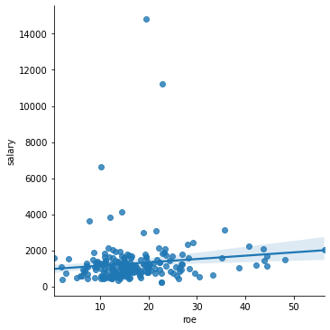
Note the outliers. To “zoom in”, let’s ignore those data points.
sns.lmplot(x='roe', y='salary', data=ceos[ceos['salary'] < 4000])
<seaborn.axisgrid.FacetGrid at 0x7f520e27f2b0>
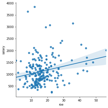
There seems to be some sort of positive correlation, as indicated by the upward-sloping line. But the fit is not good. Why? This is something that we will investigate further.